


Improve user adoption with our custom software development services. Create simple, clear, and engaging applications that users want to use.
You launch a product.
People sign up.
And then… nothing really happens.
Users don’t come back. Exploration remains limited. No complaints are reported either.Just quiet drop-offs.
This is one of the most confusing situations for any product team because, on paper, everything looks fine. The features are there. The flows work. There are no major bugs.
But still, adoption is low.
The problem may not be what you built.
It may be how the application feels to use.
Where Things Start Going Wrong
1. The First Experience Feels Like Work
Pretend that your app has just launched. How do you think your users will behave in this situation?
Chances are that they will quickly lose interest if they have to:
- Fill in multiple forms
- Manage too many preferences
- Understand too many options
The point where your users get actual utility out of your application determines how much interest they will sustain.
Most users don’t want to figure everything out first.
They want to see something useful right away.
If that doesn’t happen, they may leave before they have a reason to return.
2. The UI Is Technically Correct, But Mentally Tiring
A lot of apps are functional but not easy to use.
You might have:
- Too many buttons
- Labels that make sense internally but not to users
- Screens packed with options
- Inconsistent layouts
Nothing is technically broken, but using the application still feels like work.
That alone can make users stop.
People may not leave only because an application is unusable. They may also leave when every task feels harder than it needs to be.
Improve User Adoption

3. Users Don’t Get Clear Feedback
Consider a simple example.
You click a button, but nothing happens immediately.
The application shows no loader. Users receive no confirmation. The screen shows no visible change.You start wondering:
- Did it work?
- Should I click again?
- Is something wrong?
This uncertainty also erodes trust.
Users feel that the wait they experience is longer when the application does not give them a clear response.
4. The Product Doesn’t Guide the User
Many applications expect users to explore and figure things out on their own.
However, most users come with a specific task in mind.
If it’s not clear:
- What to do next
- Where to click
- How to complete a task
They may drop off.
A good product does more than show features.
It guides users toward the next useful action.
5. It Feels Slower Than It Should
Users perceive an application as slow even if your backend is fast.
- Lane loading screens
- Sudden layout shifts
- Slow response times
- Lack of progress indicators
Perhaps the most important aspect of an application is how quickly the user interface responds.
This is exemplified by Google’s Core Web Vitals, which focus on loading performance, visual stability and responsiveness.
So, perceived performance matters along with actual technical speed.
What Actually Helps Improve Adoption
You don’t always need a full redesign.
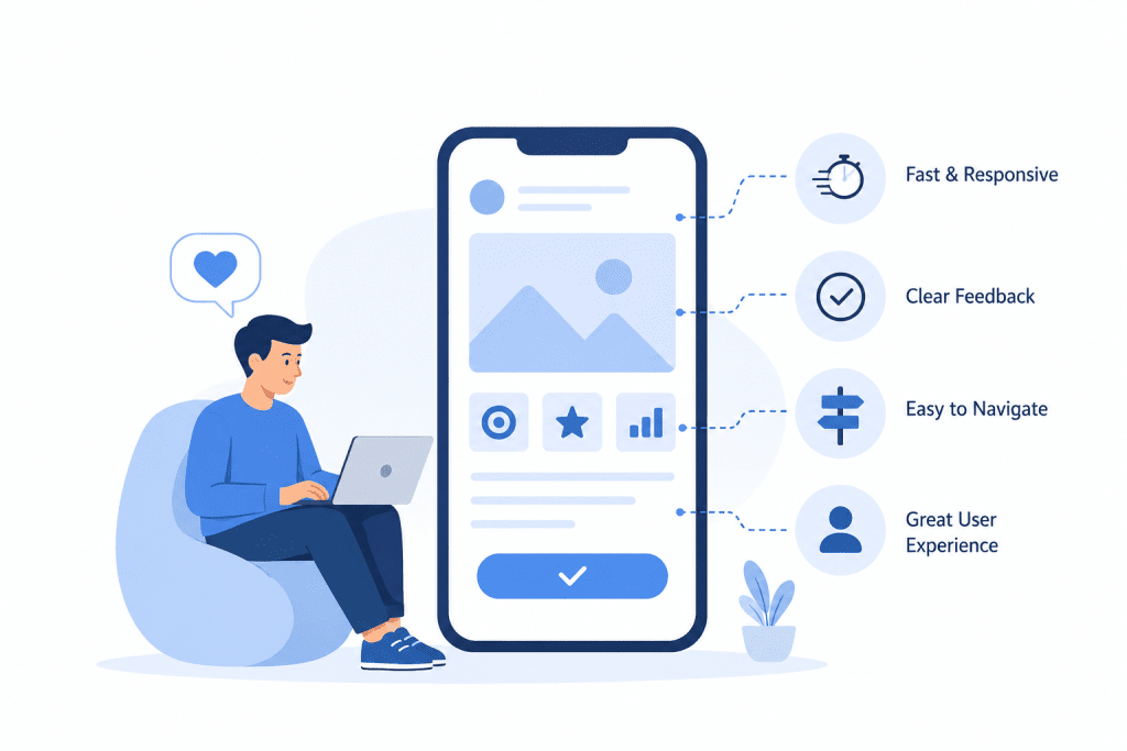
Instead, start with small, focused changes that remove friction from the user experience.
Start by Showing Value Immediately
Instead of asking users to set everything up first, let them see something useful right away.
For example:
- Show a sample dashboard
- Pre-fill some data
- Let them try a core feature instantly
Once users see the value, they are more likely to spend time setting up the rest of the application.
Simplify What’s on the Screen
Not everything needs the same level of attention.
- Keep layouts consistent
- Highlight the main action
- Reduce unnecessary options
Each screen should make the next step clear.
If users have to stop and think about what to do, it is not a good design.
Give Clear, Immediate Feedback
Every interaction should give users a clear response.
- Feedback should confirm the outcomes of an action.
- Blank states should never be unexplained.
Clear feedback helps an application feel more reliable and easier to use.
Guide Instead of Expecting
Instead of leaving users on their own:
- Add small hints
- Highlight next steps
- Use simple tooltips where needed
- Provide sensible defaults
The goal is to reduce the number of decisions users need to make.
Make It Feel Fast
You don’t always need to make every process faster. You can also improve how the application communicates progress.
- Use loaders or skeleton screens
- Avoid unexplained blank states
- Keep transitions smooth
- Show progress when an action takes time
A responsive interface helps users feel more in control of the application. While INP defines the speed of an interface’s response to user actions, CLS helps track the unwanted movement of interface elements.
A Simple Example
A team created a dashboard with multiple features and plenty of advanced functionality.
However, users adopted the dashboard extremely poorly.
Why?
A confusing design
The interface offered no architecture for progression
Many actions were inconspicuous
The interface offered little assistance
Rather than adding functionality, the team decided to declutter the interface through the following changes.
Reduction of elements in initial design
Highlight of important actions
Clarification of interface design
User adoption improved with these design changes.
Signs You Might Be Facing This
Issues with application experience may be present if the following cases exist.
- Users sign up, but never return
- Drop-offs in onboarding flows are high
- Features are present, but usage is low
- Users ask for help to perform simple tasks
- Excessively short or quick sporadic sessions
These are usually signs of poor design and not of poorly designed features.
Multiple metrics should be employed to understand user struggles in your application. Don’t rely on single metrics.
Conclusion
Users don’t think in terms of features, modules, or architecture.
They ask themselves:
“Is this easy to use?”
“Does this help me quickly?”
If the answer is no, they may move on.
Improving adoption isn’t always about adding more. It’s about making what you already have simple, clear, responsive, and worth using.

