


")


Digital transformation for logistics is shaping the future with real-time tracking, automation, and analytics. Discover key benefits and best practices presented by our Digital Transformation Team.
Smartphones are no longer accessories. They have become a lifeline for people in the online world. With any product or service available at their fingertips, consumers no longer need to step out of their homes. Shoppers compare prices on the go, students research coursework on their phones, and professionals use apps to manage everything from banking to healthcare. In this environment, businesses cannot treat mobile design as an afterthought. The organizations that thrive are the ones that embrace a mobile-first strategy, where mobile devices serve as the foundation for digital experiences.
Today, we explore the concept of mobile-first strategy, its guiding principles, its benefits for businesses, and best practices for putting it into action. Along the way, we’ll look at case studies, industry trends, and future predictions that highlight why mobile-first has become essential in 2025.
Overview
- What is a Mobile First Strategy
- The Evolution of Mobile First Thinking
- Core Principles of Mobile First Design
- Why Businesses Are Moving Toward Mobile First
- Impact of Mobile First on Conversion Rates
- The Top Benefits of a Mobile First Strategy
- Real World Examples of Mobile First Success
- Developing a Mobile First Strategy: Best Practices
- Future of Mobile First in 2025 and Beyond
- Retail Brand Goes Mobile First
- Design Mistakes to Avoid in Mobile First Strategy
- Frequently Asked Questions
What is a Mobile First Strategy?
The term “mobile first” was introduced by Luke Wroblewski in his 2009 book “Mobile First”. His message was straightforward: design for the smallest screen first, then scale upward. At that time, many businesses built desktop websites first and then tried to shrink them down for phones, resulting in awkward layouts and frustrating user experiences.
Mobile first flips this process. Instead of cramming desktop features into a phone, businesses prioritize mobile design at the start. This ensures that essential functions, smooth navigation, and fast performance come first. Desktops then inherit a richer version of that design.
“If you can create an experience that works beautifully on a phone, larger screens will naturally adapt. That principle remains the heart of mobile first even more than a decade later.”
– Daniel Newman, Technology Analyst
The Evolution of Mobile First Thinking
To understand why mobile first matters today, let’s look at how digital behavior has shifted:
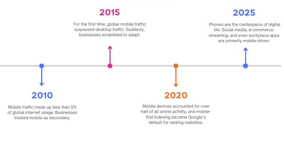
Back in 2010, mobile traffic represented less than five percent of global internet usage, so most businesses treated mobile channels as secondary. By 2015, the landscape had shifted dramatically when global mobile traffic surpassed desktop for the first time, pushing companies to scramble and adapt. In 2020, mobile devices accounted for more than half of all online activity, and Google reinforced this shift by making mobile-first indexing the default for ranking websites. Fast forward to 2025, and phones have become the centerpiece of digital life, powering social media, e-commerce, streaming, and even workplace applications.
This trend is not slowing down. In fact, the next wave of wearables, foldable devices, and 5G connectivity will make mobile-first design even more critical.
Core Principles of Mobile First Design
A true mobile-first approach rests on four major principles:
1. Focused Content
Phones limit space. This forces businesses to decide what really matters. Rather than overwhelming users with excessive details, mobile first highlights the key tasks people want to complete, like making a purchase, reading an article, booking a service, or contacting support.
For example, e-commerce leaders simplify checkout forms for mobile users. Instead of requiring long details upfront, they allow quick sign-in, autofill for addresses, and minimal clicks. This reduces frustration and encourages conversions.
2. Simple and Clear Design
On a phone, users often browse in short bursts, while commuting, waiting in line, or multitasking. A clear design reduces cognitive load and helps people act quickly. Clean menus, larger text, and uncluttered pages make mobile sites feel approachable.
Think of Instagram. The design emphasizes images and simple gestures. The focus on clarity keeps users engaged for hours, despite the app’s simplicity.
3. Speed and Performance
Research shows that over half of users abandon a page that takes more than three seconds to load. Every delay reduces trust and conversions. Mobile-first design prioritizes lightweight pages, compressed visuals, and minimal code to ensure quick performance even on slower connections.
4. Touch-Friendly Interactions
Phones rely on taps and swipes. Buttons must be finger-friendly, links need enough spacing, and gestures should feel intuitive. Designing for touch ensures that users are not forced to zoom in or struggle to hit tiny targets.
Why Businesses Are Moving Toward Mobile First
The case for mobile first is driven by user behavior:
- Teenagers and young adults live on their phones. Nearly 80% of teens use phones over laptops for online access.
- Content consumption is mobile-dominated. Approximately 70% of media, including news, video, and social updates, is accessed through mobile devices.
- Shoppers expect personalization. Surveys reveal that 35% of users want apps tailored to their preferences, while over 60% expect personalized emails linked to past purchases.
These habits show a clear message that a desktop-only strategy leaves too many gaps. Businesses that delay mobile-first adoption risk irrelevance.
Impact of Mobile First on Conversion Rates
One of the clearest benefits of a mobile-first strategy is the improvement it brings to conversion rates. In digital business, every click, tap, and scroll is an opportunity to guide a visitor toward becoming a customer. Mobile-first ensures that those opportunities are not wasted.
Faster Load Times = Higher Conversions
Studies have shown that a one-second delay in mobile page load time can reduce conversions by nearly seven percent. In an age where attention spans are short, speed directly influences buying decisions. Mobile-first sites are designed to be lightweight, which keeps users engaged long enough to complete their intended action.
Simple Navigation Encourages Action
When a mobile site is clutter-free and intuitive, users can quickly find what they want. This reduces drop-offs and increases the likelihood of completing tasks such as signing up for newsletters, adding items to carts, or finalizing payments. For instance, Amazon’s famous one-click checkout is a prime example of mobile-first thinking that eliminates friction and pushes conversions higher.
Mobile Payments and Trust
The rise of secure mobile payment systems like Apple Pay, Google Pay, and UPI has made it easier than ever for customers to complete transactions. When the buying process is smooth and trustworthy on mobile, people are more inclined to finalize purchases without hesitation.
Real-World Data on Mobile Conversions
- Retail apps with well-structured mobile-first designs often see conversion rates three times higher than their mobile websites.
- According to Google, more than 50 percent of online purchases happen on mobile devices, and the number is still climbing each year.
- Businesses with mobile-friendly checkout processes reduce cart abandonment by nearly 20 percent compared to those with desktop-centric flows.
A mobile-first approach does not just make a site look good on smaller screens. It directly impacts the bottom line by removing obstacles, building trust, and speeding up the path to purchase.
The Top Benefits of a Mobile First Strategy
1. Expanding Reach and Audience
Mobile traffic now dominates the web, representing more than half of global usage. By focusing on mobile, businesses can reach untapped audiences, including younger consumers and those in emerging markets where phones are the primary internet device.
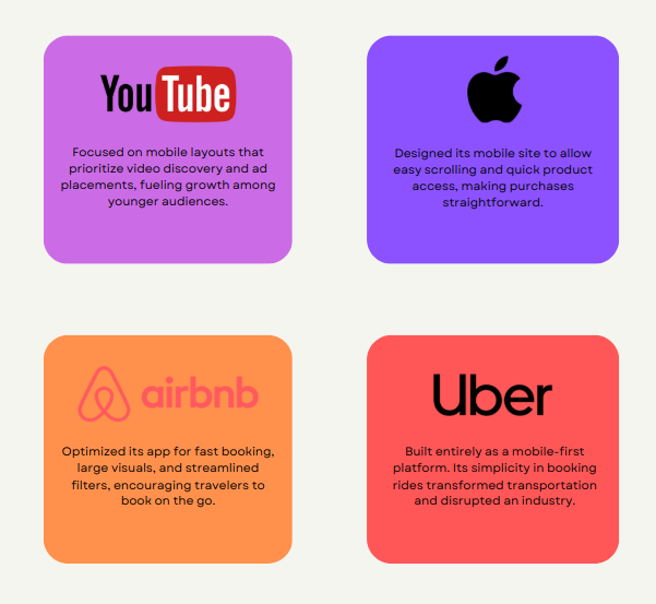
YouTube’s mobile-focused design helped it grow into one of the largest platforms in the world. More than 40% of its traffic comes through mobile devices, and mobile-first thinking played a role in securing lucrative ad contracts.
2. Improved Search Rankings
Since Google adopted mobile-first indexing, mobile usability directly affects search rankings. Mobile-friendly sites load faster, rank higher, and appear more often in local searches. This boosts visibility and drives organic traffic.
Imagine two competitors selling similar products. One site loads quickly on mobile and has an easy checkout process. The other struggles with slow pages and poor navigation. Google favors the first, which translates to more visitors and higher revenue.
3. Better Customer Relationships
Mobile platforms offer tools for direct engagement. Push notifications, chatbots, social integrations, and in-app messages create continuous connections between brands and customers. This builds loyalty and encourages repeat interactions.
For example, Starbucks leverages mobile apps to send personalized offers, reward points, and easy reordering options. Customers not only purchase more frequently but also feel valued.
4. Stronger User Experience
When sites are designed for phones, users benefit from smoother navigation. Features such as larger buttons, simplified menus, and shorter forms reduce friction. This leads to higher satisfaction and longer time spent on the site.
Pitchfork, a music publication, redesigned its mobile version to emphasize thumb-friendly buttons and quick navigation. This made content easier to browse and improved reader engagement.
5. Data-Driven Insights
Mobile devices generate valuable behavioral data. Location tracking, session time, and scroll depth reveal how users interact. Businesses can use this data to personalize campaigns, refine offerings, and make informed decisions.
6. Cost Efficiency Over Time
Although a mobile-first design may require more resources upfront, it saves costs in the long run. Instead of constantly reworking desktop-heavy designs, businesses build scalable experiences that adapt across devices. This reduces maintenance and creates consistent branding.
Real-World Examples of Mobile First Success
Developing a Mobile First Strategy: Best Practices
Here are a couple of tips from our team to help you get started with the Mobile-First strategy:
- Keep tap targets between 7–10 mm for comfort.
- Include app ratings, surveys, or chat options for quick feedback.
- Use visual cues, short guides, and simple steps for new users.
- Beta testing identifies bugs and ensures smooth launches, so text extensively.
- Use keywords, screenshots, and localization to stand out on app stores.
- 6. Use chatbots to provide instant answers while reducing support costs.
- Minimalism works best on small screens.
- Create clear calls to action.
- Send relevant, timely updates without overwhelming users.
Future of Mobile First in 2025 and Beyond
Looking ahead, mobile-first will continue evolving with new technology. The future of mobile-first strategies is shaped by emerging technologies that continue to redefine user expectations. The rollout of 5G networks has already made browsing faster and experiences more immersive, setting a new benchmark for mobile performance. Foldable phones are adding another layer of complexity and opportunity, requiring adaptive designs that work seamlessly across changing screen sizes.
At the same time, the growing use of voice search is reshaping how users navigate and consume content, pushing businesses to rethink how information is structured. Wearable devices are further expanding the definition of mobile, creating new demands for compact, glance-friendly interfaces. Adding to this, AI-driven personalization is making mobile interactions smarter, more intuitive, and deeply engaging, ensuring that every experience feels relevant to the individual user. Businesses that embrace these changes early will stay ahead of consumer expectations.
Case Study: Retail Brand Goes Mobile First
Consider a mid-sized retail brand struggling with declining online sales. Their desktop site worked well, but customers abandoned the mobile version due to slow loading and confusing menus. By shifting to a mobile-first approach, they:
- Simplified navigation with a three-step checkout process.
- Introduced personalized push notifications with product recommendations.
- Improved page load times by compressing images and reducing code.
- Added chatbots for instant support.
Within six months, mobile sales increased by 45%, customer satisfaction scores rose, and the brand gained a stronger search presence.
Design Mistakes to Avoid in Mobile First Strategy
While mobile-first design has countless advantages, many businesses stumble during execution. Poor design decisions can frustrate users and undo the very benefits the strategy is meant to deliver. Here are the most common pitfalls to avoid:
Overloading Pages with Visuals
Large, heavy images may look attractive on desktops, but they slow down mobile experiences. Slow load times cause users to abandon sites before they even explore the content. A mobile-first design should favor compressed images and visuals that add real value rather than decoration.
Tiny or Hard-to-Tap Buttons
Nothing frustrates mobile users more than buttons that are too small to press comfortably. When calls to action are hard to reach or require zooming, users often give up. Best practice is to use large, finger-friendly buttons placed in natural thumb zones for easy access.
Ignoring Readability
Fonts that look fine on a computer screen can appear tiny or cramped on a phone. If users have to pinch and zoom to read, they are likely to leave. Mobile first design requires clear typography, sufficient spacing, and a layout that flows vertically.
Neglecting Accessibility
A truly mobile-first design should be inclusive. Ignoring features like screen reader compatibility, color contrast for visibility, or captions for multimedia content excludes a portion of the audience. Accessibility is not only a moral responsibility but also a business advantage, as it broadens the reach of your content.
Overcomplicating Navigation
Desktop websites often use layered menus or hover-based navigation. These do not translate well to mobile. Users should be able to move through the site with minimal taps, clear labels, and straightforward pathways. Hamburger menus, sticky navigation bars, and prominent search features often work better on smaller screens.
Forgetting to Test Across Devices
One of the biggest mistakes is assuming that a design that looks good on one mobile device will work on all. Screen sizes, resolutions, and operating systems vary widely. Without thorough testing, businesses risk alienating segments of their audience.
Intrusive Pop-Ups
Pop-ups that take over a small mobile screen or are hard to close can drive users away instantly. While pop-ups can be effective for capturing leads, they should be used sparingly and designed with mobile interactions in mind.
The key to avoiding these mistakes is by focusing on the user’s comfort and clarity. A mobile-first design succeeds when it feels natural. It should be fast, easy to read, and simple to interact with. Small details like button size, font readability, and navigation structure can make the difference between a loyal customer and a lost opportunity.
Frequently Asked Questions
Q. Is mobile first only for apps?
No. Mobile first applies to both apps and websites. It’s about prioritizing the mobile experience, regardless of platform.
Q. Does mobile-first mean ignoring desktop users?
Not at all. It means starting with mobile design and then scaling up. Desktop users still benefit from cleaner layouts and refined experiences.
Q. How do I know if my site is mobile-friendly?
Google offers a mobile-friendly test that analyzes URLs. Page speed tools also reveal how well your site performs on phones.
Q. Is mobile-first expensive?
Initial investment can be higher, but it reduces long-term costs by avoiding multiple redesigns and improving conversions.
Q. What industries benefit most?
Retail, finance, travel, healthcare, and entertainment have all seen major gains. In reality, any business with an online presence benefits from mobile-first.
[Need assistance with a different issue? Our team is available 24/7.]
Conclusion
Mobile first is not a trend. It is a fundamental shift in how people interact with the digital world. Businesses can deliver experiences that resonate with today’s mobile-centric audience by focusing on clarity, speed, and user needs.
In 2025 and beyond, businesses that embrace this strategy will stay competitive, while those that ignore it risk falling behind. Talk to our team today!


0 Comments